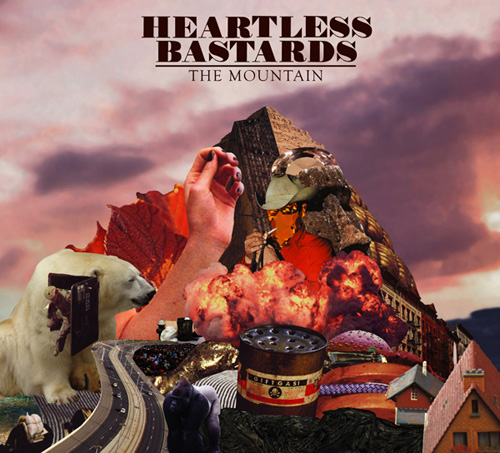
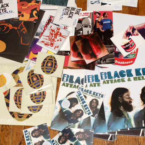
Michael Carney has illustrated a lot of high profile album covers, most notably the entire discography for The Black Keys (you may note that he shares a last name with the drummer of the band, Pat Carney (his bro)). Most recently, he did the artwork for The Mountain, by The Heartless Bastards. The record is one of my favorites of the year so far, so I thought it would be a good subject to kick off this new series on the site. I sent Carney some questions about this release and his career in general.
How Did This Project Come About?
The Heartless Bastards are on Fat Possum Records and I have been doing random freelance stuff for them since 2003/late 2002 when I did the cover for Thickfreakness for The Black Keys. Matthew Johnson (Fat Possum mastermind) really liked that cover.. (He once told me I should shoot myself because there is no way I will ever do anything better than that cover.)
Anyway, I have worked with Matthew for a while and he tends to flow me whatever work he can. Usually the bands already have an art guy and want nothing to do with me… in this case Erika (the singer/guitar player songwriter) told Matthew she wanted me to do the cover for her record. That was during the summer of 2008. I did some other random stuff for them leading up to this cover, (t-shirts and a poster) and that gave us some time to get used to working together. Their manager, Ginna, who is great, also played a huge roll in making this happen.
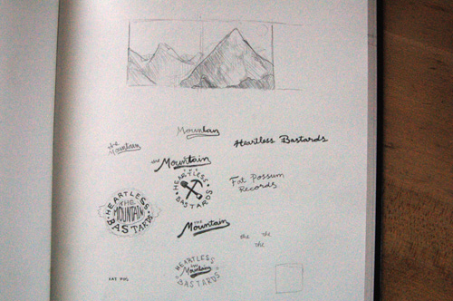
Early sketches
What was the initial direction you were given?
The only thing I was told was “a menacing mountain”. At fist I did a painting but I realized that my painting style does not really lend itself to being “scary”, so I did a collage. I originally wanted to use only scary/creepy imagery but I decided that would make it seem like some kind of goregrind album. I don’t know if it ended up looking menacing, perhaps it just turned out weird..
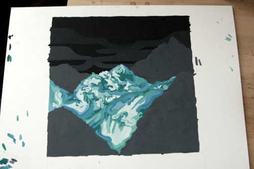
Painting idea that I didn’t use
The artwork for all three Heartless Bastard LPs dont seem to have any consistency… The first record was a photo of the band, the second LP was a drawing, and this one is a crazy Mountain collage. Was it your decision to not do an illustration/photo of the band?
From what I know, three different people have done the three covers. And from what I understand am the only person who had an excessive amount of time to work on the packaging. I was given a pretty open direction and was free to take it where I wanted. I probably could have done an image of the band, but I felt like an album called “The Mountain” should have a mountain on the cover. I usually try to avoid being too literal in how the name relates to the image, but I thought it seemed like the type of album title that required an image that relates back.
This project took like two months because I did a finished painting that took a month and then started over because it did not seem right… but that is no different from any project I have done of this nature. My goal is to make something the band is proud of and that they will still feel proud of in ten or twenty years.
Did you do anything different for the vinyl release?
The album was too long to fit on to one 12″ and not long enough to require double vinyl, so the album comes with a 7 inch that has a printed sleeve. The art from that is a modified version of the inside of the CD.
How long have you been illustrating album artwork and how many albums have you done so far?
Eight years. Wow, I just had to figure that out and it made me feel old. At this point I have done the packaging for 18 LPs, 2 dvds, and a bunch of singles/E.P’s. I did the first one my first year in college and worked on six different covers while I was going to school (CCAD). I studied video at school and tried to keep my freelance stuff a secret. I usually didn’t tell my teachers and I think they thought I was a slacker beacuse I half assed my school work so that I could have time to do the freelance stuff. I showed the dean of my department during my last semester and I think it blew his mind because all my profesors pretty much thought I was a loser (which is not to say that I am NOT in fact “a loser”).
What was your first album?
I did a cover for the band my brother was in before The Black Keys but that album will remain nameless. I did the cover for The Big Come Up but the label guy did the layout. But it was The Black Keys’ Thickfreakness where I did everything on that. That cover was done in a span of about two weeks during finals of the winter semester of my sophmore year at school. My brother and I drove around Akron trying to think of an idea and after about 4 hours we ended up at Super K-Mart because we needed stuff for a different idea. We found the can of pomade and immediately had the concept. We drove straight home, moved all of the lamps in his house into one room, covered his hand in pomade and shot about 100 photos.

Recent things that have been inspiring your work:
I feel like the internet has been clogging my brain, I tend to troll design blogs and what not, but that usually does more damage than anything. I check ffffound.com pretty frequently. A lot of what gets posted makes me bummed about design, but some of it is mind blowing. I really could go the rest of my life without looking at anymore design where the subject matter is design itself, such as illustrations of pantone books and nice typography that is about typography. That stuff makes me want to cut out my eyes.
Right now I am really into looking at books and magazines. I feel like I spend way to much time on the internet and I think printed stuff can resonate in my brain easier.
Here is some stuff I have been looking at lately.
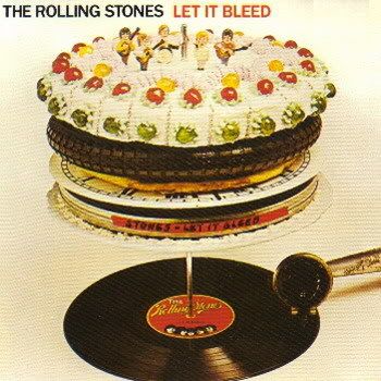
This is one of my favorite album covers. When I am pitching a weird concept, a lot of times I bring up this cover. It’s weird, it makes no sense, but it’s amazing.

This is a retrospective of covers by Hipgnosis. They did covers for Led Zepplin and Pink Floyd. Peter “Sleazy” Christopherson from throbbing gristle worked there.
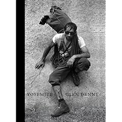
Mind blowing photos of mountain climbers from the sixties. I kind of wish I had this prior to doing The Heartless Bastards cover. This is a good book to look at when you feel overwhelmed. You may have alot of shit to do, but at least you are not half way through climbing a mountain.

I have really been slacking on going there lately, but I usually go and dig around when I am confused about what to do for a project. That’s probably my biggest inspiration in Columbus: all eras and genres of music and design for music. I would like to say I collect records, but a lot of my purchases are misguided, I tend to pass up GOOD records, for stuff with weird or really bad packaging.
Upcoming projects?
I am currently working on the art for the album Perfect Cities by a band called The Other Girls from Cleveland. The album comes out on Audio Eagle in May. I have only heard three songs but they are great, sounding like indie rock that I grew up on. Other than that I am kind of taking it easy.
Sometime in the late summer or fall I need to start on the new Black Keys album. They don’t record till around August, but I will most likely try and start sometime before that.
What about projects not related to album art?
My band, Deathly Fighter, has an album coming out sometime in the spring on CDR. We recorded it with my brother in Akron the weekend before christmas. We are currently getting everything sorted for the album release and will hopefully start recording new stuff in the next few months.
There is also a monthly thing at The Summit called Moral Tales that I dj at with detox and trueskills.
Show us your work area


Learn more about Carney on his personal website.
more of this on the site please!!
i am loving it
mike carney
no jokes
I find it hard to read articles on the internet; I’m very much a paper in hand person, but this one kept me interested…maybe it’s pictures help, maybe I’m biased or maybe it was the very insightful quote:
“You may have alot of shit to do, but at least you are not half way through climbing a mountain.”
Great read! More content like this please!!!
Really glad you decided to do this. Do more!
Nice. Go Ocean Prophet!
Pingback: Behind the Artwork: Times New Viking’s Born Again Revisited
Pingback: The Black Keys Featured in Rolling Stone Magazine
Hello can I reuse for the first image at the top of the page as I’d like to reuse it on my own private site if that is ok?